 |
| PSD/HTML Conversion: Code a Clean Business Website Design |
لتعلم تصميم الموقع المطبق عليه من هنااااا
Before Starting
Make sure that you have the Photoshop file (PSD) that we produced in the first tutorial — you’ll need this to extract the images that we’ll be including in the template.
If you haven’t completed the Part 1 tutorial yet, then I’d advise you to go through that first tutorial before starting this one (or at least download the PSD file from that first tutorial).
In this tutorial (Part 2), I’ll be assuming that you have some basic HTML and CSS knowledge — however, if anything is unclear, please leave a comment below and I’ll do my best to help out.
Creating the File Structure
1 Create a new empty folder on your desktop called "template" (or whatever you prefer).
2 Inside of that empty folder, create another folder called "images" — this folder will contain all of the images that we need to display in the template.
3 Then create three new files and name them index.html, style.css, and reset.css.

The index.html file is where we will write all of the HTML for our template, while the style.css file will include all the CSS styling code that will make everything look nice and pretty.
Setting Up reset.css
In the reset.css file, . The primary reason for this is that different browsers tend to have inconsistencies in the way that they display different HTML elements (e.g. font sizes of headings, the size of margins and padding, etc.). Using a reset stylesheet enables us to reduce the impact of these inconsistencies.
4 I’ll be using Eric Meyer’s Reset CSS. Copy the Reset CSS code into your own reset.css file.
Add the Basic HTML Markup
5 Now open up your index.html file using a code editor. I’ll be using Coda (a popular web development IDE for the Mac OS) for this tutorial, but you can use whichever application you prefer. Add a basic structure for a new HTML page — most source code editing applications (like Coda and Adobe Dreamweaver) provide a function for this (or do it automatically for you). Here’s the code block for your basic HTML markup.
<!DOCTYPE html PUBLIC "-//W3C//DTD XHTML 1.0  Transitional//EN"  "http://www.w3.org/TR/xhtml1/DTD/xhtml1-transitional.dtd">
 <html xmlns="http://www.w3.org/1999/xhtml">
     <head>
         <meta  http-equiv="Content-Type" content="text/html;  charset=UTF-8" />
         <title>My HTML  Website Template</title>
     </head>
     <body>
     </body>
 </html>
Reference Your Stylesheets
6 Inside the
<head> tags of index.html, you need to add the following line of code to reference our main stylesheet.<link rel="stylesheet" type="text/css" href="style.css" media="screen" />
This tells index.html page where to find your main stylesheet.
7 Now open your style.css file and add the following line of code at the top of the document to also reference our reset.css file.
@import "reset.css";
This ensures that the reset styling included in the reset.css file is called before any of our other CSS stylesheet (which is important because of the CSS inheritance model).
Excellent! All three files are now connected and talking to each other, so we can start coding up the theme.
The Template Structure
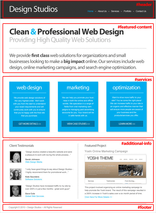
Below, you can see the basic layout structure and main sections of the HTML/CSS template. Study it for a bit to familiarize yourself with the different sections of our web page layout.
Code the Basic Page Section
8 We’ll start by creating the basic structure in our index.html. Add the following code block for the layout sections.
<div id="wrap">
     <div id="header">
     </div><!--end header-->
     <div  id="featured-content">
     </div><!--end  featured-content-->
     <div id="services">
     </div><!--end services-->
     <div  id="additional-info">
         <div  id="client-testimonials">
           </div><!--end client-testimonials-->
         <div  id="featured-project">
         </div><!--end  featured-project-->
     </div><!--end additional-info-->
     <div id="footer">
     </div><!--end footer-->
 </div><!--end wrap-->
As you can see, we’re holding all of the main sections of the template within the
#wrap container to make it easier for us to center our web page.The main sections of our web layout include
#header, #featured-content,#services, #additional-information (which contains #client-testimonials and#featured-project), and the #footer.Create the Background
9 To create the background of our HTML/CSS template, we initially need to slice out the background image from the PSD file. We will be using the same method for slicing out the different CSS background elements throughout this tutorial, and I’ll just give you a brief summary of the procedure here. First step: in Photoshop, choose the Rectangular Marquee Tool (M) and make a narrow selection that includes the header and white background.

10 Once you’ve made the selection, go to Edit > Copy Merged, create a new Photoshop document (Ctrl/Cmd + N), and then paste the selection in the new document (Photoshop should automatically determine the size dimensions of the new document based on the image you have in the clipboard).
11 You then need to go to File > Save for Web & Devices to save the file. Choose the GIF file format and then save it as
main-bg.jpg inside your images folder.12 Now add the following code to your style.css file to set the background.
/*-----------------GENERAL STYLES-----------------*/
 body { background: url(images/main-bg.jpg) repeat-x;  font-family: arial; }
 #wrap { width: 960px; margin: 0 auto; }
Here we’re attaching the background image to the
<body> of the HTML document and then repeating it across the page along the x-axis.We’re also setting the width of page layout and ensuring that it’s centered on the screen (
margin: 0 auto; centers the layout).Adding the Logo
13 We now want to add the logo to the header. To do this, we initially need to extract it from the PSD. Select the layer that the logo is stored on and then right-click the thumbnail next to layer name (circled below).
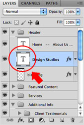
This will select the logo text for you.

14 Copy this text again, create a new document, and then paste it into the new document.
15 Choose Save for Web & Devices again, choose PNG-24 as the file format and save the file as
logo.png in the images folder.We use the PNG file format here because we want the image to have a transparent background so that it can be easily displayed on any background color.
16 Now add the following HTML to your index.html file to set the markup for our site name/logo.
<div id="header">
     <h1>Design Studio</h1>
 </div>
17 Then we need to style our markup to set
logo.png as the CSS background image of #header h1. Add this code block to the style.css file./*---------------------HEADER---------------------*/
#header { height: 130px; }
#header h1 { float: left; background: url(images/logo.png) no-repeat; width: 347px; height: 66px; text-indent: -9999px; margin: 38px 0 0 0; }
We’re initially setting the height of the header container and then attaching the logo image to the
h1 element.We utilize a technique called CSS background image replacement which attaches a background image to an element and then moves the content associated with the element off the screen via the use of
text-indent: -9999px attribute/value pair.The CSS background image replacement approach provides some SEO benefits and also makes it easier for users who are using screen readers to understand the content of your page.
Make the Navigation
18 To create the navigation area, add the following HTML to your index.html file.
<div id="header">
     <h1>Design Studio</h1>
     <ul id="nav">
         <li><a  href="#">Home</a><span  class="nav-divider">--</span></li>
         <li><a  href="#">About Us</a><span  class="nav-divider">--</span></li>
         <li><a  href="#">Services</a><span  class="nav-divider">--</span></li>
         <li><a  href="#">Portfolio</a><span  class="nav-divider">--</span></li>
         <li><a  href="#">Contact Us</a></li>
     </ul>
 </div><!--end header-->
19 Now add the following CSS to your style.css file.
#header #nav { float: right; margin: 72px 0 0 0; }
 #header #nav li { float: left; font-size: 16px; }
 #header #nav a { color: #eee; text-decoration: none; }
 #header #nav a:hover { color: #00aeef; }
 #header #nav .nav-divider { color: #eee; padding: 0 10px; }
This again is quite simple: We’re initially floating the
#nav container to the right of the page and also moving it 72px from the top using the margin attribute. The <li>elements are then floated to the left to ensure that all page names are displayed next to each other and not on separate rows.The rest of the code simply styles the links and the "–" characters that is used as a divider between the different page names.
Code the Featured Content Section
20 To create this section, we need to slice several images from our PSD. The first is the title. We want to follow the same process we used previously when slicing out the logo. So, select the layer that the title is stored on in the Layers Panel, right-click the thumbnail on that layer to select the text, copy the text, and then create a new Photoshop document.
21 Paste the text into the new document and then save the title into your images folder via the Save for Web & Devices command (call it
featured-content-title.png).
22 Then do exactly the same for the subtitle (name this file
featured-content-subtitle.png), the dotted line (name this horizontal-line.png), and the text (featured-content-text.png).23 Now that we have extracted all the images required, we need to write our HTML. Add the following code block inside the
#featured-content container in your index.html file.<div id="featured-content">
<h2>Clean and Professional Web Design</h2>
<h3>Providing High Quality Web Solutions</h3>
<div class="horizontal-line"></div>
<p>We provide first class web solutions for organizations and small businesses looking to make a big impact online. Our services include web design, online marketing campaigns, and search engine optimization.</p>
<div class="horizontal-line"></div>
</div><!--end featured-content-->
24 Then add the following code to your style.css file to style our elements.
 /*-----------------Tools-----------------*/
 .horizontal-line { background:  url(images/horizontal-line.png) no-repeat; width: 950px; height: 10px; }
 /*------------FEATURED CONTENT SECTION------------*/
 #featured-content { margin: 65px 0 0 0; }
 #featured-content h2 { background:  url(images/featured-section-title.png) no-repeat; width: 811px; height: 66px;  text-indent: -9999px; }
 #featured-content h3 { background: url(images/featured-section-subtitle.png)  no-repeat; width: 720px; height: 57px; margin: -8px 0 30px 1px; text-indent:  -9999px; }
 #featured-content p { background:  url(images/featured-section-text.png) no-repeat; width: 957px; height: 126px;  margin: 30px 0 25px 0; text-indent: -9999px; }
In these code blocks, we start by moving the
#featured-content section down by 65px using the margin attribute.We then utilize the CSS image replacement technique again for the
h2, h3, and pelements to display the images that we extracted.The styling for the horizontal line (
.horzontal-line) has been written in a separate section (using CSS comments to label the sections), as we’ll be using this in other containers as well. This helps to keep our code clean and organized.Create the Services Section
25 Let’s first extract the images we require from our PSD. We need the blue Services box background (save it as
services-box-bg.png), the large headings in each of the boxes (save it as web-design-title.png, marketing-title.png, andoptimization-title.png respectively), the horizontal dotted line (service-dotted-line.png), and the buttons at the bottom of each of the boxes (get-more-details-button.jpg, view-case-studies-button.jpg, and learn-more-button.jpg). Follow the same process for extracting and saving the images as used in previous steps.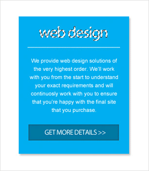
26 Now add the following code inside the
#services container in your index.html file.<div id="services">
<div class="service-box first">
<h2 class="web-design-title"></h2>
<div class="service-dotted-line"></div>
<p>We provide web design solutions of the very highest order. We’ll work with you from the start to understand your exact requirements and will continuously work with you to ensure that you’re happy with the final site that you purchase.</p>
<a href="#" class="more-details"></a>
</div><!--end service-box-->
<div class="service-box">
<h2 class="marketing-title"></h2>
<div class="service-dotted-line"></div>
<p>We can help you promote your business in both the online and offline worlds. We specialize in a range of fields from viral marketing campaigns to managing paid advertising accounts for you. Your brand will be in safe hands with us.</p>
<a href="#" class="view-case-studies-button"></a> </div>
<!--end service-box-->
<div class="service-box">
<h2 class="optimization-title"></h2>
<div class="service-dotted-line"></div>
<p>Want to drive more traffic to your site? You’ve come the right place! We can increase traffic to your site in an organic and effective manner that will ensure more people are aware of your business and the products/services you offer. </p>
<a href="#" class="learn-more-button"></a> </div><!--end service-box-->
</div><!--end services-->
<div class="horizontal-line"></div>
In this code block, we’re adding three new containers which are all assigned a class of
.service-box. Inside each of these service boxes is a title, a dotted line, the text content for that box, and a button.The first service box is also assigned a class of
.first (class="service-box first") because we need to slightly change the styling of this container from the others.27 Now add the following CSS to your main stylesheet for styling our Services section.
/*--------------------SERVICES--------------------*/
 #services { padding: 40px 0; height: 355px;  }
 #services .service-box { float: left; background:  url(images/service-box-bg.png) no-repeat; width: 233px; height: 301px; margin: 0 0 0 46px; padding: 22px 28px 30px 26px; }
 #services .first { margin-left: 0; }
 #services .service-box h2 { margin: 0 auto; }
 .web-design-title { background:  url(images/web-design-title.png) no-repeat; width: 186px; height: 48px; }
 .marketing-title { background:  url(images/marketing-title.png) no-repeat; width: 186px; height: 48px;  }
 .optimization-title {  background: url(images/optimization-title.png)  no-repeat; width: 200px; height: 48px;}
 .service-dotted-line { background:  url(images/service-dotted-line.png) no-repeat; width: 237px; height: 3px;  margin: 10px 0 24px 0;  }
 #services p { font-size: 14px; color: #fff; line-height:  21px; text-align: center; margin: 0 0 24px 0; }
 #services .more-details { display: block; background:  url(images/get-more-details-button.jpg) no-repeat; width: 232px; height: 41px;  }
 #services .view-case-studies-button { display: block;  background: url(images/view-case-studies-button.jpg) no-repeat; width: 232px;  height: 41px; }
 #services .learn-more-button { display: block; background:  url(images/learn-more-button.jpg) no-repeat; width: 232px; height: 41px; }
The above code is again making use of the CSS background image replacement technique where necessary to display the appropriate images.
The rest is generally just setting the padding and margins on the different elements for positioning and spacing of the various elements.
One thing to note is that the left margin on the
.service-box class is set to 46px. This is to provide consistent spacing between the different service boxes. However, if the first box has a left margin set to 46px, it will not be on the left side of the template and will look a little odd.To fix this oddity, we therefore set the left margin for the
.first class to 0 to override the original margin attribute value from the .service-box styling, ensuring that the first service box is correctly aligned on the left side of the template.Make the Client Testimonials Section
28 We need to slice out the title for this section. Use the same process as before and save the file as
client-testimonials-title.png.
29 Add the following code inside the
#client-testimonials container in index.html.<div id="client-testimonials">
<h3>Client Testimonials</h3>
<div class="testimonial">
<div class="author-img">
<img src="images/author-img-1.jpg" alt="Sarah Johnson" />
</div><!--end author-img-->
<p>"Design studios created a beautiful website and were an absolute pleasure to work with..."</p>
<p class="author-name">Sarah Johnson</p>
<a href="#">Web Design Media</a>
</div><!--end testimonial-->
<div class="testimonial">
<div class="author-img">
<img src="images/author-img-2.jpg" alt="Kate Saunders" />
</div><!--end author-img-->
<p>"I only have great things to say - I would highly recommend DS for online promotional work..."</p>
<p class="author-name">Kate Saunders</p>
<a href="#">Software Solutions</a>
</div><!--end testimonial-->
<div class="testimonial">
<div class="author-img">
<img src="images/author-img-3.jpg" alt="Dave Cole" />
</div><!--end author-img-->
<p>"Design Studios have increased traffic to my site by over 200% in three months - great work guys!"</p>
<p class="author-name">Dave Cole</p>
<a href="#">Global Web Services</a>
</div><!--end testimonial-->
</div><!--end client-testimonials-->
This is fairly straightforward: We’ve got three new
.testimonial containers that each contain an image of the testimonial author, the testimonial text, and the name of the author along with their company/organisation’s name.30 Now add the following CSS to your style.css file.
 /*----------------ADDITIONAL INFO-----------------*/
 #additional-info { margin: 38px 0 0 0; height: 420px;   }
 #additional-info #client-testimonials { float: left; width:  425px; padding: 0 45px 0 0; }
 #additional-info #client-testimonials h3 { background: url(images/client-testimonials-title.png)  no-repeat; width: 180px; height: 28px; margin: 0 0 24px -5px; text-indent:  -9999px; }
 .testimonial {  margin: 0 0 32px -5px;  }
 .testimonial .author-img { float: left; background-color:  #ccc; width: 84px; height: 84px; margin: 4px 28px 0 5px; }
 .testimonial img { margin: 3px 0 0 3px;  }
 .testimonial p { color: #555; font-size: 14px; line-height:  21px; margin: 0 0 12px 0; }
 .testimonial p.author-name { font-weight: bold; margin: 0;   }
 .testimonial a { color: #00aeef; font-size: 14px;  text-decoration: none; }
 .testimonial a:hover { color: #555; }

The first three lines in the above code block all deal with the parent container
#additional-info — the height of the container is set along with the margins.One of the key points here is that the width of the
#client-testimonials container is set to 425px with 45px of padding on the right. This needs to be the same for both this section and the "Featured Project" section (we’ll talk about this section later down the tutorial) as they both use half of the screen.31 Between these two containers, we need to add the vertical line and use it as a divider. Slice this image out of the PSD file and save it as
vertical-line.png.
32 Now add the following line of code between the
#client-testimonials and#featured-project containers in your index.html file.<div class="vertical-line"></div>
33 Then include this CSS code block under the
.horizontal-line class that we defined earlier..vertical-line { float: left; background: url(images/vertical-line.png) no-repeat; width: 4px; height: 385px; }
The CSS above ensures that the vertical line is displayed between the two different sections.
Make the "Featured Project" Section
34 As with the client testimonials section, we need to slice out the "Featured Project" heading from our PSD template. Save the file as
featured-project-title.png.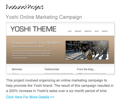
35 Now add the following HTML markup code block to your index.html file.
<div id="featured-project">
     <h3>Featured Project</h3>
     <h4>Yoshi Online Marketing  Campaign</h4>
     <img src="images/featured-project-image.png"  alt="Yoshi Screenshot" />
     <p>This project involved organizing  an online marketing campaign to help promote the Yoshi brand. This resulted in  a 200% increase in Yoshi’s sales over a six month period of time. </p>
     <a href="#">Click Here  For More Details >></a>
 </div><!--end featured-project-->
36 Then add this CSS code block to your style.css file to style the "Featured Project" section.
 /*----------------FEATURED PROJECT----------------*/
 #featured-project { float: left; margin: 0 0 0 45px; width: 425px; }
 #featured-project h3 { background:  url(images/featured-project-title.png) no-repeat; width: 160px; height: 32px;  margin: 0 0 16px -5px; text-indent: -9999px; }
 #featured-project h4 { font-size: 20px; color: #888;  font-weight: normal; margin: 0 0 8px 0; }
 #featured-project img { margin: 0 0 7px 0; }
 #featured-project p { font-size: 14px; color: #555;  line-height: 21px; margin-bottom: 7px; }
 #featured-project a { color: #00aeef; font-size: 14px;  text-decoration: none; }
Again, the width of this container is 425px with 45px of left padding. The CSS image replacement technique is used to display the "Featured Project" title with the rest is simply setting the margins, colors, and font sizes of the various elements.
Coding the Last Section: The Footer
37 The footer is very simple to code. Add the following HTML to your index.html file.
<div id="footer">
<div class="horizontal-line" style="clear: both"></div>
<p>Copyright © 2010 ~ Design Studios ~ All Rights Reserved</p>
</div><!--end footer-->
In the footer, we’re just displaying another horizontal line to act as a divider between the
#additional-info container and the #footer. Some standard copyright text is then included underneath this.38 Now add this CSS code block to your style.css file for styling our footer section.
/*--------------------FOOTER----------------------*/
 #footer { height: 70px; padding: 0 0 30px 0; }
 #footer p { font-size: 16px; color: #888; padding: 14px 0 0  0; }
The styling here is quite straightforward: We’re defining the height of the
#footercontainer and then setting the bottom padding to 30px to provide some breathing room at the bottom of the web layout template.We also set the font size and color of the copyright text and give them some padding at the top to move the text away from the horizontal line.
Finished!
That’s everything done. If everything has gone according to plan, hopefully you have some that looks like the following screenshot.


0 التعليقات :